Today we focused on pie charts in Math. We did a pie chart using Skittles. Mr.Glade gave us 10 skittles in a cup and we used the data from the cup and recorded it. Then he choose 10 people and we added up there data and we got higher numbers. My data was kinda accurate to the whole class data. We deiced that a larger sample is more accurate then a smaller sample, because the bigger the sample the closer you get to knowing the actual data. Here are the pie charts we made showing our data and the classes data.
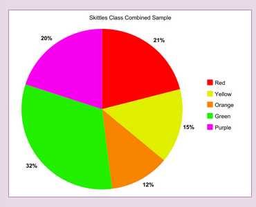
This is the class combined sample. This one was out of 100%. We figured that out by adding up all the data.
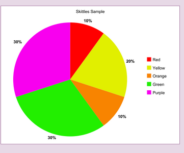
This was my data from the 10 Skittles in the cup. Some of my percentages were higher then the classes percentages. Some were almost exactly the same. Some were only 2 or 3 percent off.
 RSS Feed